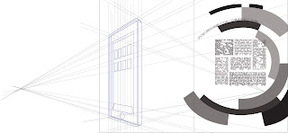
These are inspired by the German Bauhaus and Italian Futurism movement. Colors seemed to be a little less vibrant during these periods, and of course neither Germany nor Italy had much to be colorful about: Nazism in the first and Fascism in the second were rising fast and all the graphics moved towards a more stern, less fancy style. The movement of futurism in italy was promoting new architecture, ideals and art, all based on an abrupt break with the past and promoting war to burn all of it and start a new kingdom point blank. Gray and dark colors were preferred and these inspired my work.
Article #1 - taxing the wealthy / Article #2 - Google + opening
For the first, I basically re-made the first assignment in a Bauhaus style. In the second, the choice of making that i-Pad illustration was inspired by some drawings of italian new architecture of 1930. I chose to do these two articles in these styles because I think it's interesting to connect something that was promoting change and breaks with the past to taxes, which is something that has always been there, an evergreen of history. About the Google article, I decided to make it in Futurism style because the article itself made it sound like a big innovation, and it's astounding to think about how social networks and new things like iPads and apps have changed our everyday life in just about a few years. I drew that iPad like a new style building to symbolize the coming of a new internet era. I think it's a connection that makes sense.
Posting new projects soon!


Nessun commento:
Posta un commento