venerdì 30 settembre 2011

Sva assignment #2 - 3rd article: 1980's

"Animal rights collide with fashion interest":

I have always thought of the eighties as something really funky, for some reason. Maybe because it was like that. I haven't lived through them, but we see things that were fashionable in the 80's everywhere still today. Fur was very big back then, so it was only logical that I would choose the 80's for an article about fur used in fashion. The font came out all weird and crooked, but I decided to leave it like that for now. In an 80's contest I feel like it kinda makes sense.


This one makes me think of a book cover, or maybe a leaflet...I did it without really thinking about what I was doing. :/

First two projects (#2 assignment): Bauhaus & Futurism (1930)


I believe these two projects need a brief explanation:


These are inspired by the German Bauhaus and Italian Futurism movement. Colors seemed to be a little less vibrant during these periods, and of course neither Germany nor Italy had much to be colorful about: Nazism in the first and Fascism in the second were rising fast and all the graphics moved towards a more stern, less fancy style. The movement of futurism in italy was promoting new architecture, ideals and art, all based on an abrupt break with the past and promoting war to burn all of it and start a new kingdom point blank. Gray and dark colors were preferred and these inspired my work. 


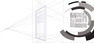
Article #1 - taxing the wealthy / Article #2 - Google + opening
For the first, I basically re-made the first assignment in a Bauhaus style. In the second, the choice of making that i-Pad illustration was inspired by some drawings of italian new architecture of 1930. I chose to do these two articles in these styles because I think it's interesting to connect something that was promoting change and breaks with the past to taxes,  which is something that has always been there, an evergreen of history.  About the Google article, I decided to make it in Futurism style because the article itself made it sound like a big innovation, and it's astounding to think about how social networks and new things like iPads and apps have changed our everyday life in just about a few years. I drew that iPad like a new style building to symbolize the coming of a new internet era. I think it's a connection that makes sense. 


Posting new projects soon! 

mercoledì 28 settembre 2011

2nd assignment inspiration swipe!

I was thinking about researching ads from various countries and taking inspiration from them for this assignment. It is interesting to research typography in a specific historical context, hopefully I'll be able to find as many fonts as I can for this assignment. So there we go:

Fonts from France ~ late 1800's:
Fonts from France ~ 1920:


Fonts from Italy ~ late 1800's:


Fonts from Italy ~  1930:


Fonts from Germany ~ 'Die Brucke' 1905 and 'Bauhaus' 1930:


Fonts from America ~ 1960:

Fonts from 1980 / 1990: 


venerdì 23 settembre 2011

Beginning - Intermediate course

Hopefully I will be able to make up for missing class due to UN traffic/plane delays.
In the meantime, this is a drawing of me. In reality I have crooked teeth, but oh well. 


Cheers ! :D